Design Language
Accessibility
VertiGIS products are required to meet WCAG 2.2 Level AA. This is a requirement, not an enhancement. A feature that cannot be operated by keyboard, cannot be read by a screen reader, or does not meet the contrast minimums is not finished, regardless of how it looks.
Accessibility is far cheaper to design in than to retrofit. Most of the work happens before implementation: in the tab order implied by a layout, in the colours chosen for a state, and in whether an interaction has a non-visual equivalent. Building from the design system components rather than raw HTML gets you much of this for free, but it does not absolve you of checking the result.
Keyboard Navigation
Every part of an application must be reachable and operable with the keyboard alone. If a user can do it with a mouse, they must be able to do it without one.
- All interactive elements (buttons, links, fields, tabs, menu items, grid rows, panel controls) must be focusable and operable with the keyboard. Use real interactive elements rather than click handlers on a
div, which are invisible to keyboard and assistive technology alike. - Avoid keyboard traps. A user who tabs into a region must be able to tab out of it. Modals, embedded maps, date pickers, and third-party widgets are the usual offenders. A modal is the one place where focus is deliberately held, and it must still release focus on
Escand return it to the control that opened it. - Focus must always be visible. Never remove a focus indicator without replacing it with something at least as clear; see Focus under Lists and Menus for the treatment we use.
- The focused element must not be hidden by other content. Sticky headers, docked footers, floating toolbars, and toasts routinely cover the control a user has just tabbed to. Scroll the focused element into a clear area rather than letting a fixed layer sit on top of it.
- Move focus deliberately when the view changes. Opening a panel or dialog should send focus into it; closing one should return focus to where the user left off.
- Support the conventional keys for the pattern:
Escto dismiss,EnterandSpaceto activate, arrow keys to move within a composite such as a list, tab set, or menu.
Pointer Targets and Dragging
Not everyone using a pointer is using it precisely. Touch, a trackpad, a head pointer, or a tremor all make small and drag-only targets hard to hit.
- Interactive targets should be at least 24 by 24 CSS pixels, or be separated by enough space that a 24px circle centred on each does not overlap its neighbours. Inline links within a sentence are exempt, as are controls whose size is set by the browser.
- Anything you can do by dragging must also be doable with a single tap or click. Reordering columns in a data grid, rearranging list items, and adjusting a slider all need a non-drag path: a menu command, a pair of move buttons, or arrow key support on the focused element.
- Do not rely on path-based gestures such as swiping or drawing a shape. If a gesture is offered, provide a simple alternative alongside it.
- Keep destructive controls away from the targets a user reaches for often. Small targets and close neighbours turn a mis-tap into an accident.
Colour Contrast
Contrast minimums are the most commonly missed requirement, and the easiest to verify.
- Body text and images of text must meet a contrast ratio of at least 4.5:1 against their background.
- Large text (24px and above, or 18.66px and above when bold) may drop to 3:1.
- Interface components and meaningful graphics must meet 3:1. This covers field borders, focus indicators, icons that carry meaning, and the parts of a chart or map symbol a user has to distinguish.
- Check every state, not just the resting one. Hover, focus, selected, and error states all have to hold the ratio, and low-emphasis states are where contrast quietly fails.
- Never use colour as the only way to convey information. Pair it with a label, an icon, a pattern, or a change in shape. Status indicators and validation messages are the common failures here.
- Placeholder text, helper text, and disabled controls still need to be legible. Disabled controls are exempt from the contrast minimum under WCAG, but treating that exemption as permission to make them unreadable is a poor outcome for everyone.
Use the theme palette rather than one-off colour values (see Colors), and verify unfamiliar pairings with a contrast checker before committing to them.
Screen Readers
A screen reader user must be able to reach every area of the application and understand it in a logical order.
- Content must be exposed in a sensible reading order. The order in the DOM is the order it will be announced, so it should match the order the interface is meant to be read in; CSS that visually reorders content does not reorder it for assistive technology.
- Structure the page with real landmarks and a correct heading hierarchy. Headings are how screen reader users skim; do not pick a heading level for its size. See Headings under Typography.
- Every control needs an accessible name that describes what it does. Icon-only buttons need an explicit label, since the icon alone announces nothing.
- Images need
alttext that conveys their meaning. Decorative images should have an emptyaltso they are skipped rather than announced. - Fields must be programmatically associated with their labels, and error messages associated with the field they describe, so both are announced when the field receives focus.
- Announce changes that happen away from the user's focus. Toasts, validation summaries, and results that update in place need a live region, or the user will not know anything happened.
- Prefer native semantics over ARIA. Reach for ARIA only when no native element expresses the pattern; incorrect ARIA is worse than none.
Considerations
- Test with the keyboard first. Unplug the mouse and try to complete a task end to end; it is the fastest way to find trapped focus, unreachable controls, and invisible focus states.
- Automated tooling catches perhaps a third of accessibility problems. It is good at contrast and missing labels, and blind to reading order, focus management, and whether a label is actually meaningful.
- Test with a real screen reader on the platform your users are on. Behaviour differs enough between them that passing in one proves little about the others.
- WCAG 2.2 is backwards compatible with 2.1: everything that met 2.1 AA still counts, and the new criteria are additions rather than replacements. The one removal is the old parsing requirement, which is no longer part of the standard.
- Accessible design is usually better design. Clear focus states, generous targets, meaningful labels, and predictable order help everyone, not only users relying on assistive technology.
Visual Loudness
Every element on a screen has a volume. A filled button in the primary colour is loud. A text link in body copy is quiet. Loudness is not about size alone; it is the combined effect of colour, contrast, weight, size, and the space an element is given.
The useful part of the metaphor is that loudness is relative. Nothing is loud on its own, only louder than what surrounds it. A single filled button on a quiet panel is impossible to miss. Put six of them side by side and the user has to read all six to find the one they want, because the design has stopped ranking them. This is what Design Philosophy means by keeping loudness at an appropriate level: the goal is not a quiet interface, it is an interface where the important thing is the loudest thing.
What Makes an Element Loud
These are the levers available in this design system, roughly in order of how much attention they buy:
- Colour. The primary and secondary theme colours are the loudest tool available, which is why they are reserved for the action that matters and for status that needs to be noticed. Greys carry structure. See Colors.
- Fill and contrast. A solid fill is louder than an outline, which is louder than text alone. This is exactly the progression the button emphasis levels encode, from High to Medium to Low.
- Size and weight. Larger and heavier type pulls the eye first. The type scale is the sanctioned way to change this. Picking a heading level for its size rather than its meaning trades away structure for emphasis, and costs you accessibility as well.
- Space. Space makes an element louder without adding anything to the screen. An element given room reads as more important than one packed in among its neighbours. See Spacing.
- Motion and iconography. Both are loud out of proportion to their size. An animated indicator or a coloured icon will be noticed before a paragraph of text.
Setting the Level
- Decide what is loudest before you design the rest. Each view should have one clear answer to "what is the user here to do", and the design should say so without the user having to hunt.
- Turn things down rather than up. When something does not stand out, the instinct is to make it bigger, bolder, or brighter. It is almost always better to quieten what surrounds it. Escalating emphasis is how interfaces end up shouting.
- Match loudness to consequence and frequency. A rarely used destructive action does not deserve a high emphasis button just because it is important to get right. Frequency earns prominence; severity earns confirmation. The two are not the same.
- Reserve the loudest treatments for genuine interruptions. Alerts and notifications work because they are rare. Used for routine feedback, they train users to dismiss them without reading.
- Keep dense views quiet. In a data grid or a stacked panel, the sheer number of elements raises the baseline. Repeating an emphasis treatment on every row is the fastest way to make a view unreadable.
- Stay consistent across views. If a High emphasis button means "this completes the task" in one place, it cannot mean "this is a shortcut we would like you to try" in another. Loudness only communicates if it means the same thing everywhere.
Considerations
- Squint at the design, or blur it. Whatever survives is what the user sees first. If that is not what you intended, the hierarchy needs work rather than more decoration.
- View it in greyscale. A hierarchy that collapses without colour is relying on colour alone, which fails for users who cannot distinguish it. See Colour Contrast.
- Count the elements competing for attention. More than a few in one view usually means the design has an editing problem rather than a styling problem.
- Loudness accumulates over time. Each feature added on its own seems reasonable, and the view still gets noisier with every one. Revisit the hierarchy of an established view when you add to it, rather than only the piece you are adding.
Spacing
Consistent spacing is what makes an interface feel deliberate rather than assembled. Our products follow MUI's spacing system, which is based on a single base unit of 8px. Every margin, padding, and gap should be expressed as a multiple of that unit rather than as an arbitrary pixel value.
Working from a fixed scale keeps rhythm consistent across components built by different people at different times, and it means spacing responds correctly to the system wide density settings instead of being locked to one visual weight.
The Scale
Spacing is applied in multiples of the 8px base unit, which produces a predictable set of steps:
- 4px (half step) - reserved for tight relationships, such as the gap between an icon and its label, or between a field and its helper text.
- 8px - the default. Use it for spacing between closely related elements within a group.
- 16px - separates distinct elements within the same group, such as consecutive fields in a form.
- 24px - separates groups of related content from one another.
- 32px and above - separates major regions of a layout, or provides breathing room around the outer edge of a container.
Avoid half steps below 4px. If a design appears to need 2px or 3px of separation, the elements are almost always better handled by adjusting alignment or line height instead.
Applying Spacing
- Use the theme's spacing scale rather than hard-coded pixel values. Hard-coded values do not scale with density settings and tend to drift out of alignment as a design evolves.
- Space is the primary way we communicate relationship. Elements that belong together should sit closer to one another than they do to unrelated content, and reducing the space between a label and its field is usually more effective than adding a border or background to group them.
- Prefer fewer distinct steps. A layout that uses 8px, 16px, and 24px reads as more considered than one that uses six subtly different values.
- A component should not set its own outer margin. The parent is responsible for the space around its children, along with their positioning and flow. See Sizing and Spacing under Buttons for how this applies to interactive elements.
- Do not override the internal padding of design system components. That padding is pre-set so components can participate in density settings consistently.
Considerations
- Vertical rhythm matters more than horizontal precision. Uneven vertical spacing in a stacked layout, such as a form or a panel, is far more noticeable than a slightly narrow gutter.
- Whitespace is not wasted space. Resist the urge to fill it, particularly in dense views where the temptation to compress is strongest.
- Be careful when spacing is the only thing separating actions. Confirmation and cancellation controls that sit too close together invite mistakes, especially on touch devices.
Buttons
Applications built on VertiGIS Studio Web technology have many button variants and options available but VS Web does not use all of the available options. To simplify the choices, VS Web uses three basic types of buttons. They are based on the level of emphasis required for the task. There are 'Low', 'Medium', & 'High' emphasis buttons.
Usage
As a general guideline there should only be one High emphasis button per view. Typically buttons are used at the end of forms used in pairs, such as “Submit” and “Cancel”. Usability best practices state that the user should always have the ability to safely exit a task so it is always recommended to have a 'Cancel' button available.
Depending on the purpose of the button you can use combinations of a High Emphasis and Medium Emphasis button, two Medium Emphasis buttons, or a Medium and Low Emphasis buttons.
Developer notes:
- Low Emphasis buttons consist of MUI Text Variant buttons using the 'Primary' colour
- Medium Emphasis buttons consist of MUI Outlined Variant buttons using the 'Primary' colour
- High Emphasis buttons consist of MUI Contained Variant buttons using the 'Primary' colour
Visit the Developer Center for more details for implementing buttons
Action Button Order and Alignment
The primary action (eg: Save, Apply, etc.) must be the first button in the hierarchy of buttons. In the context of a form, it should be the first thing a keyboard user will tab too after filling in all of the form inputs. The secondary action (eg: Cancel or Back) button follows after the primary action in the tab order.
As a general guideline, forms with labels and inputs stacked on top of each other (as in most VertiGIS Studio applications) it's better to align your buttons with the start of the content. That means left-aligned in most languages and right-aligned in RTL languages. The close proximity of the buttons to the form inputs and labels allows the eye to simply follow the natural flow down the page to find the submit action. This is especially true when using large screens where your form input and action buttons potentially end up on opposite sides of the screen.
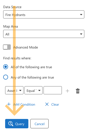 Buttons aligned with the labels and the start of the content | 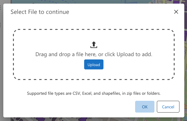 Buttons aligned to the end of the dialog |
If the form is in a dialog then the common practice is to place your action buttons at the end of your content (right-aligned for most languages and left-aligned in RTL languages). The smaller contained space of a dialog creates a natural ending place for your eye to flow to at the end of the content area.
Small screens and mobile devices can also use center-aligned or full width action buttons to help draw attention to the primary action and to reduce the distance you have to reach with your thumb or finger to tap on a button.
When deciding if your form button alignment should be to the left or right, it's important to consider the specific context and user needs when designing a form. Conducting user testing and gathering feedback can help ensure that the button alignment aligns with user expectations and improves usability. If you're still unsure, then the default fallback position should be to align the buttons with the start of your content (left-aligned).
Button Labels
Always attempt to use concise, descriptive, and actionable labels with three or fewer words for buttons. Verbs are ideally suited for buttons to prompt the user to perform the desired action. Button labels must use 'Title Case' where each main word has the first letter capitalized.
Sizing and Spacing
Sizing of buttons are set to "small", "medium", or "large" by using the "size" prop on the button. The width of a button will automatically adjust to the length of the content (icon and/or label).
Padding within the button should not be altered or over-ridden in CSS as the padding is pre-set in the Design System so that buttons can participate in the system wide density settings. Margin around buttons should be controlled by the parent component. The parent component is responsible for the spacing around child components (like buttons), positioning, flow, and sometimes the size. Please refer to the Developer Center for more information on presentation attributes.
Additional Options
Icons can be added to buttons for added emphasis or to help convey the purpose of the button. For added visual style flexibility, you can choose to use the "round" style to create circle or pill shaped buttons. You can also choose to have a button with only an icon and no text.
Form Design
A properly designed form allows people to quickly enter values in a logical order and in a manner that makes sense to them. This requires fields to be flexible when interpreting the user's input.
Labels
-
Are easily interpreted.
-
Located on top of or to the left of most fields.
- Labels on the top is better for internationalization and long strings.
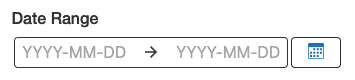
- Labels on the top is better for internationalization and long strings.
-
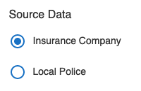
Usually appear to the right of check boxes and radio buttons.
-
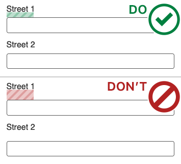
Ensure there is not too much space between the label and it's associated field so that it is clear which field goes with the label.
Fields
- The length of text fields should suggest the amount of data that should be entered.
- Ensure that there is not too much space between fields so that nothing gets accidentally overlooked.
Links/Buttons
- Primary actions should be clear and obvious.
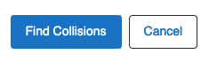
- Secondary actions are for more discrete actions.
- Multi-step and complex forms should have all other navigation removed.
- Back links should be included for easy corrections in multi-step forms.
- Include a Cancel link to provide a safety net for users to escape the form.
Error Messages
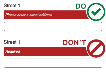
- Provide clear and constructive error messages.
Do's and Don'ts
- Don't require unnecessary input.
- Allow people to undo actions where appropriate.
- Require confirmation for (important) irreversible actions.
Keyboard Use
- Do not force users to frequently switch between the keyboard and mouse.
- Correct tab order is set up.
- If possible, avoid drop-down lists where typing is quicker.
- Auto-complete or auto-suggest is very beneficial.
Be Helpful
- Be flexible when interpreting the values that users enter.
- Eg: when entering a phone number, accept both no-spaces and dashes.
- Help users check the information they've entered before submitting.
- WCAG 3.3.4 requires error prevention for legal and financial data so that it is reversible, checked for errors, and confirmed.
- If possible, provide confirmation or error information where the user's attention is currently via immediate inline feedback.
- If possible, try to avoid multiple columns for form layouts. This increases the likelihood that something in the right column will be missed.
- Remove any unnecessary distractions and links that competes with and takes the users attention away from the form they are filling out.
Icons
Where can I find the Icons?
Our master repository of icons, consists of over 600 pre-created icons ready for use in our icon package. Instructions on how to install packages can be found in the Developer Center. We store all our icons in this online repository, in several formats (png, svg, pdf). The .svg format icons are comprised of compound paths, black #000000), and an artboard of 24px by 24px. They have been stripped of all unnecessary meta info and optimized using the SVGo optimization script included in the repo.
How do I use icons in my app?
Instructions for using either built in icons, or your own, can be found in the Developer Center.
How do I create a custom icon?
When creating our icons, simplicity is key. Since we are working with a canvas of only 24px x 24px, every design provided must be concise and communicate the idea clearly, and easily. Fine details are less important than trying to ensure that shapes stay recognizable. Information regarding this process is available in the Developer Center.
Style
The visual language of our icons should be consistent, creating a harmonious appearance across all of our products:
- All icons must be made using a single color (black), with negative space being transparent.
- When employing linework, trying to maintain at least 2 pixels in width, with an equal amount of white space allows the designs to remain clear when viewed at 100%. This guideline is flexible however, depending on what elements are used.
- Modifiers must be placed in the bottom right of the icon, with a border of 2px of empty space outlining it.
- Simplistic, clear, and simple designs are preferable to complicated patterns.
- The visual loudness of the icon should convey its importance, but not overpower other messages surrounding it, including the written identifier.
Available Icons
Accessibility
AccuracyOff
ActionMenu
Activate
ActivitiesFind
Add
AddIntersectingVertex
AddSquare
AddToDrawLayer
Address
AddressSearch
AdjustHeight
AfterActionPlayback
Ai
Alarm
AlarmAdd
AlarmClear
AlarmDisabled
AlarmInfo
AlarmNone
AlarmNotifications
AlignToEdge
ArcgisSave
ArcgisShortcut
Archive
Area
AreaRetired
Arrow
ArrowBack
ArrowBottomLeft
ArrowBottomRight
ArrowBoxDown
ArrowBoxUp
ArrowDown
ArrowLeft
ArrowRight
ArrowTopLeft
ArrowTopRight
ArrowUp
AssignSurveyorGrid
AssignSurveyorWorkOrder
AssignVendorMapGrid
AssignVendorWorkOrder
Attach
AttachFilePhoto
AttachManage
AttachMultipleFiles
Authentication
Band
BaseballField
Basemap
Bearing
Binary
BladingLane
BladingNeighborhood
BladingReport
BladingTotal
Bluetooth
BoardmapSearch
Book
Bookmark
BoxFalse
BoxTrue
Branding
BroadbandCoverage
BroadbandExplore
BroadbandFind
Buffer
BufferIdentify
BufferMeasure
BufferOff
BufferOn
BufferShape
Build
Button
Cabinet
CabinetAdd
CabinetEdit
CabinetRemove
Calendar
Callout
CalloutAdd
CalloutClear
CameraSwitch
Cancel
Cards
CatchBasinId
CenterMap
Certificate
CertificateAdd
CertificateEdit
CertificateMultiple
CertificateRemove
CertificateUser
ChangeTheme
ChartArea
ChartAreaRange
ChartBlank
ChartLine
ChartLinear
ChartScatter
Charting
ChartingEdit
ChartingHorizontal
Check
ChevronBottomLeft
ChevronBottomRight
ChevronDown
ChevronLeft
ChevronRight
ChevronTopLeft
ChevronTopRight
ChevronUp
Clear
ClipboardList
ClipboardLocation
ClipboardTable
Clock
Close
Cloud
CloudDownload
CloudOutline
CloudUpload
Clustering
ClusteringDropdown
Cog
Collaboration
Color
CommandMissing
Community
CommunityFind
Compass
CompletionReportMapGrid
CompletionReportWorkOrder
Conduit
ConduitAdd
ConduitEdit
ConduitRemove
ConfigItemDefault
Connection
ConnectionOff
ConnectionOn
ConsoleMoreInfo
ConstructionReport
Contact
Coordinates
CoordinatesAdd
CoordinatesAlbers
CoordinatesHide
CoordinatesLatLong
CoordinatesMapTip
CoordinatesShow
CoordinatesUtm
Copy
CopyToCollab
CrashAttenuatorAdd
CreateJob
Csv
CsvAdd
CsvExport
Cut
Dashboard
DashboardDropdown
DataEdit
DatabaseTest
DatasourceAdd
DateCancel
DateFilter
Debug
Decimal
DefaultCommand
Density
Details
DetailsDropdown
DeviceActive
DeviceComputer
DeviceLaptop
DevicePhone
DeviceRotate
DeviceTablet
Dialog
Diameter
DirectionsAlternate
DirectionsArrive
DirectionsBearLeft
DirectionsBearRight
DirectionsDepart
DirectionsExit
DirectionsForkCenter
DirectionsForkLeft
DirectionsForkRight
DirectionsMerge
DirectionsRoundabout
DirectionsSharpLeft
DirectionsSharpRight
DirectionsStraight
DirectionsTurnLeft
DirectionsTurnLeftLeft
DirectionsTurnLeftRight
DirectionsTurnRight
DirectionsTurnRightLeft
DirectionsTurnRightRight
DirectionsUTurn
DirectionsUnknown
Disclaimer
DoubleArrowBottomLeft
DoubleArrowBottomRight
DoubleArrowDown
DoubleArrowLeft
DoubleArrowRight
DoubleArrowTopLeft
DoubleArrowTopRight
DoubleArrowUp
Download
Drag
Draw
DrawArrow
DrawCircle
DrawClearAll
DrawClearAllMaps
DrawEdit
DrawEllipse
DrawExtent
DrawExtract
DrawFreehand
DrawLine
DrawMultipoint
DrawPoint
DrawPolygon
DrawPolygonFreehand
DrawPolyline
DrawRectangle
DrawReshape
DrawText
DrawTriangle
DrawUnion
DuctConnections
Dxf
DxfAdd
DxfExport
DxfLogExport
Edit
EditDoc
EditLog
EditTemplateSchemas
EmergencyFacilitySearch
Equation
Erase
Error
Export
ExtentBasic
ExtentScale
FeatureAdd
FeatureAddHydrant
FeatureAddLandUse
FeatureAddServiceRequest
FeatureAddTree
FeatureAddWell
FeatureCopy
FeatureCreate
FeatureDelete
FeatureEdit
FeatureLocation
FeatureSummary
Feedback
FgdbAdd
Fiber
FiberAdd
FiberEdit
FiberRemove
FieldConfiguration
Fields
FileAdd
FileClear
FileMulti
Filter
FilterEffects
FilterEffectsClear
FilterEffectsClearAll
FilterError
FilterOff
FilterOffAlt
FilterOn
FilterReset
FixtureSearch
Flash
Flyout
Folder
FolderAdd
FolderOutline
Form
FormEdit
Fraction
Gas
Geocode
GeocodeBatch
GeojsonExport
Geolocate
GeolocateActive
GeolocateCenter
GeolocateCenterLocked
GeolocateCentered
GeolocateDisabled
GeolocateFollow
GeolocateFollowActive
GeolocateOrientation
GeolocateReCenter
GeolocateStop
GeolocateTrack
GeolocateTrackActive
Geometry
Georss
GlobalId
Globe
GolfCourse
GpxExport
Group
GuId
Hamburger
Heating
Heatmap
HeatmapDropdown
Help
HelpCursor
Highlight
HighlightClear
HighlightClearAll
HighlightFocus
HighlightFocusClear
HighlightPulse
History
Home
Hourglass
HouseAdd
HouseEmail
HouseNumber
HouseOwner
HousePointer
HouseValue
HydrantId
IdGenerate
Identifiable
Identify
IdentifyFreehand
IdentifyMapPoint
IdentifyPolygon
IdentifyPolyline
IdentifyRectangle
Image
ImageNone
ImportJob
Info
InheritedDenied
InheritedEditable
InheritedVisible
Inspection
InspectionFeature
Integer
IntersectingFeatures
IntersectionLocate
ItemsFirst
Iwtm
Jobs
Json
JumpToPoint
Kml
KmlAdd
KmlExport
KmzAdd
Label
LabelOff
LabelOptions
Language
LayerCatalog
LayerOptions
LayerPresets
LayerRemove
LayerStyleEdit
Layers
LayersActions
LayersAdd
LayersEmail
LayersExtract
LayersFiltered
LayersMenu
LayersReorder
LayersSnapping
Legend
LegendOff
LeisureFacilitySearch
LineStyleEdit
Link
LinkExternal
LocationClear
LocationSelect
LocationSet
Lock
LpkxAdd
ManholeId
Map
Map3rdParty
MapArea
MapBing
MapDefault
MapGoogle
MapInfo
MapOffline
MapPin
MapPinExtent
MapRefresh
MapSyncOff
MapSyncOn
MapTax
Markdown
Markup
MarkupOff
Maximize
MaximizeRestore
Measure
MeasureArea
MeasureCircle
MeasureConvert
MeasureDistance
MeasureEllipse
MeasureFreehand
MeasurePolygon
MeasurePolygonFreehand
MeasurePolyline
MeasureRectangle
MeasureRestart
Menu
MenuCollapse
MenuExpand
MenuGlobal
MenuHoisted
Message
Metadata
Minimize
MinimizeRestore
Minus
MinusSquare
More
MoreCircle
Move
MoveDown
MoveUp
MultipleMove
MultipleMoveOff
NbaManagement
NeighborhoodSearch
NeighborhoodSign
NetworkConnected
NetworkDiagram
NetworkDownstream
NetworkIsolation
NetworkShortestPath
NetworkSubnetwork
NetworkUpstream
NoIcon
NorthArrow
ObjectId
OfflineMode
Ont
OntAdd
OntEdit
OntRemove
Open
OtherClearGridsHighlight
OverviewMap
Owner
Pan
Panel
PanelMinimize
PanelMore
PanelRestore
ParcelAccount
ParcelAin
ParcelId
ParcelPin
Parcels
ParkingLot
PastureSearch
Patch
PatchAdd
PatchEdit
PatchPanel
PatchPanelAdd
PatchPanelEdit
PatchPanelRemove
PatchRemove
PavementAdd
PdfDownload
PerfPlanning
Photo
Pictometry
Pipeline
PlaybackNext
PlaybackPause
PlaybackPlay
PlaybackPrevious
PlaybackRecord
PlaybackStepNext
PlaybackStepPrevious
PlaybackStop
Plus
PointStyleEdit
Pointer
PointerClear
PointerSubtract
PoleSearch
PolicingAnalyze
PolicingVisualize
PolyMarkAdd
PolyMarkUpload
PolygonAdd
PolygonCut
PolygonStyleEdit
PoolsSearch
PopIn
PopOut
Portal
PortalInfo
PotholeAdd
PotholeInspect
PotholeLayer
PotholePrint
PotholeRepair
PotholeRepairMultiple
PrintLgcy
PrintPkg
PrintPro
Privacy
Profile
ProgressReportsMapGrid
ProgressReportsWorkOrder
Property
Proximity
Query
QueryBuilder
QueryBuilderAdvanced
Queryable
Rack
RackAdd
RackEdit
RackRemove
RangeEnd
RangeStart
Redo
RefineAdd
RefineIntersect
RefineResults
RefineSubtract
Refresh
Region
ReportDataError
ReportProblem
ReportSign
Reports
ReserveSearch
RestoreDefaults
ResultCard
ResultClear
ResultClearAll
ResultDefault
ResultList
ResultPan
ReturnArrow
RoadClosure
RoadClosureSearch
RoadSignAdd
RoadSignsReport
Rooftop
RouteExpand
Rss
RubberBand
RuralSearch
Save
SaveAs
ScaleInput
Scalebar
ScanBarcode
ScanMulti
ScanQr
School
SchoolsSearch
Scroll
Search
SearchDocument
SearchDocumentDownload
SearchDocumentId
SearchExtent
SearchGuide
SearchLink
SearchNeighborhood
SearchNumber
SearchParcels
SearchPark
SearchRailway
SearchResults
SearchRoadSigns
SearchSegment
SearchStreet
SearchStreetMarking
SearchSurvey
Searchable
SectionId
SelectedAll
SelectedNone
SelectedPartial
Selection
Server
ServerManagement
ServiceFeature
ServiceGeocode
ServiceGeometry
ServiceGlobal
ServiceGp
ServiceMap
ServiceNetwork
ServicePicture
ServiceRequest
ServiceRequestInvestigate
ServiceRequestReport
ServiceStream
ServiceUpload
Settings
SewageTreatment
Sewer
Shapefile
ShapefileAdd
ShapefileExport
Share
ShareMap
SignAdd
SignIn
SignOut
Signature
SkateParkSearch
SlackLoop
SlackLoopAdd
SlackLoopEdit
SlackLoopRemove
Slider
SlotBottomCenter
SlotBottomLeft
SlotBottomRight
SlotTopCenter
SlotTopLeft
SlotTopRight
Snapping
SnappingOff
Snippet
SnowAdd
SnowGradingAssign
SnowGradingCity
SnowGradingGlobal
SnowGradingMap
SnowGradingReport
SnowGradingSelection
SnowParking
SoccerField
SortDown
SortUnsorted
SortUp
SpeedTest
SpeedTestResults
SpillAnalysis
Splice
SpliceAdd
SpliceEdit
SpliceRemove
Split
Splitter
SplitterAdd
SplitterEdit
SplitterRemove
SprayPadSearch
Stack
Star
StarAdd
StarCheck
StarHalf
StarOutline
StarRemove
StartNasProcess
StartNba
StationLocator
Stop
StreetEdit
StreetLaneMaintenance
StreetNumber
Styles
Subdivision
Subtract
Success
SuccessFilled
Suggestion
Survey
Suspend
SwapView
SwatchPicker
SweepingEdit
SweepingGlobal
SweepingNeighborhood
SweepingPrint
SweepingSelection
SwitchSearch
Symbolize
SymbolsReset
Sync
SyncManage
Table
TableAdd
TableRemove
Tabs
Taskbar
Team
TeamAdd
TeamRemove
Telco
TemplatePicker
TennisCourt
Terminate
TerminateAdd
TerminateEdit
TerminateRemove
Text
TextField
ThemeDark
ThemeLight
ThumbsDownFilled
ThumbsDownOutline
ThumbsUpFilled
ThumbsUpOutline
TipsAndTricks
Toggle3d
Tools
Topographical
TopographicalEditing
TopographicalEditingClear
Tour
TownshipSearch
Trace
TraceClear
TraceStrands
Traffic
TransformerSearch
Trash
Undo
Ungroup
Unlink
Unlock
Update
Upload
UploadLayer
UploadOptions
UrbanSearch
Usb
User
UserCog
UsersManage
UtilityCutAdd
UtilityCutDelete
UtilityCutEdit
UtilityCutMove
ValueSetConfiguration
ValveInspected
VendorsManage
Video
ViewGrid
ViewList
ViewSwitchCompact
ViewSwitchList
ViewSwitchTable
ViewSwitchTabs
Visibility
Visible
VisibleNoChange
VisibleOff
Visualizations
Warning
Water
WaterDrop
Watershed
Weather
Wifi
WindowDock
WindowNew
WorkOrder
WorkOrderClose
WorkOrderComplete
WorkOrderFastTrack
Workflow
WorkingView
Xlsx
XlsxAdd
XlsxExport
Xml
YouthCenterSearch
ZoomControl
ZoomExtent
ZoomExtentAll
ZoomFeature
ZoomFull
ZoomIn
ZoomInitial
ZoomNext
ZoomOut
ZoomPrevious
ZoomVisibleScale
Lists and Menus
Lists come into use in many aspects of our products: Feature Details, Search Results, Building information, and many more. No matter what needs to be displayed, if it falls into a list like quality, then a list should be used. Examples of different utilizations of the list element are below.
Simple List
- Line item 1
- Line item 2
- Line item 3
- Line item 4
The most straight forward of implementations. This simple list view can include text, or text and icons. The selected item's highlight will consist of the primary theme colour, as well as a gradient grey. If tabbed to, you can use your up + down arrow keys to navigate the list.
Nested List
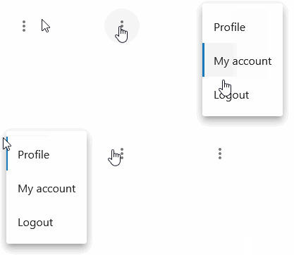
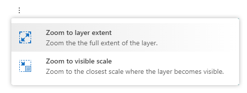
Menus are used to group additional commands for components that are not worth displaying in a more prominent visual manner, or that simply don’t belong anywhere else in the interface. Menu items consist of a single line of text to indicate what function will be triggered when the item is clicked. The hover state for menu items is built in an identical fashion to those used in list items (See above). A colored bar is added to the left side, and the background receives a gray gradient to white.
Pinned Subheader List
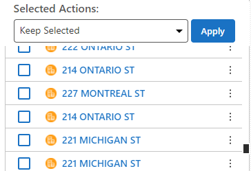
States
A few guidelines should be followed to ensure that the list element looks uniform, and fit within the application properly.
Hover
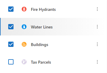
When a hover state is triggered, it cannot just rely on a colour change. There also must be a state change that shows the differentiation. For example, in our programs, there is a background colour change, as well as the addition of a side border colour. Hover states always include a styling change, and the background colour will get a gradient.
Focus
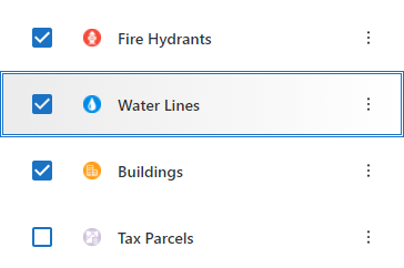
Focus indicators provide an easy way to identify currently active elements, against the rest of the design elements. Focus states must be unique from the hover state to make them distinct when using a keyboard for navigation. Focus states have a triple border design, so that regardless of the background they are implemented on, they will always be visible and easy to identify.
Selected/Active
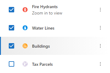
Selected and Active states for list elements should showcase similar behavior to the hover state. They must show that they are currently active, and visually distinct from the rest of the list elements.
Data Grids
Use a data grid to display tabular content. For example when you have many records that share the same set of attributes, where the user needs to compare values down a column, sort, filter, or act on individual rows. If the records are short and read one at a time, a list might be a better choice.
Our grid is a styled version of the MUI X Data Grid. The underlying behaviour (sorting, filtering, column reordering, virtualization) comes from MUI X; what we have changed is the visual treatment, so that a grid sits comfortably inside a panel alongside the rest of the design language.
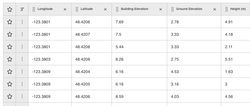
Anatomy
- Header row. Each column header holds the column name, a drag handle for reordering, and a control to remove the column from the view. The header stays fixed while the rows beneath it scroll.
- Leading action columns. Row-level controls are pinned to the left of the data, ahead of the first value column. In the example above these are a favourite toggle and an overflow menu. Keep this region narrow; it is a gutter, not a column of content.
- Data cells. One value per cell, left aligned by default, with the same padding on every row so the grid reads as an even field of text rather than a set of boxes.
Usage
- Lead with the columns that identify the record. The user should be able to tell one row from another without scrolling sideways.
- Show only the columns that earn their place. A grid that has to be scrolled horizontally on first load is usually carrying columns that belong behind a column picker.
- Keep related numeric columns adjacent and formatted the same way (the same number of decimal places, the same units) so that values line up visually and can be compared at a glance. Where a unit applies to the whole column, put it in the header rather than repeating it in every cell.
- Set a sensible default sort. An unsorted grid asks the user to do work that the view could have done for them.
- Do not override the grid's row height or cell padding. Those values participate in the density settings, and hand-tuning them in one view makes that view look out of step with every other grid in the product.
Considerations
- Grids get long. Pair one with pagination or virtualized scrolling rather than rendering thousands of rows at once, and keep the header visible so column context is never lost.
- An empty grid still needs to explain itself. Say whether there is no data yet or the current filter excluded everything, and give the user a way back.
- Row actions should be discoverable without being noisy. An overflow menu in the leading gutter is preferable to a row of icon buttons repeated on every line.
- Grids are dense by nature, so they lean hard on alignment and spacing to stay legible. Resist adding borders, background fills, or colour to separate content that spacing already separates.
Loading and Progress Indicators
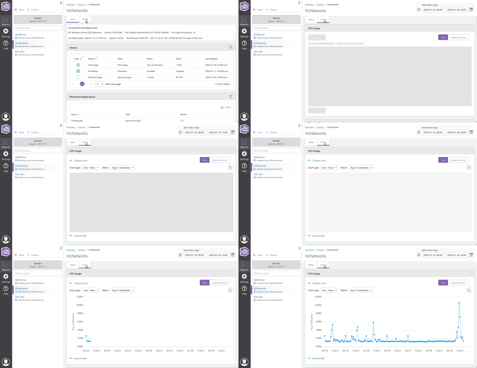
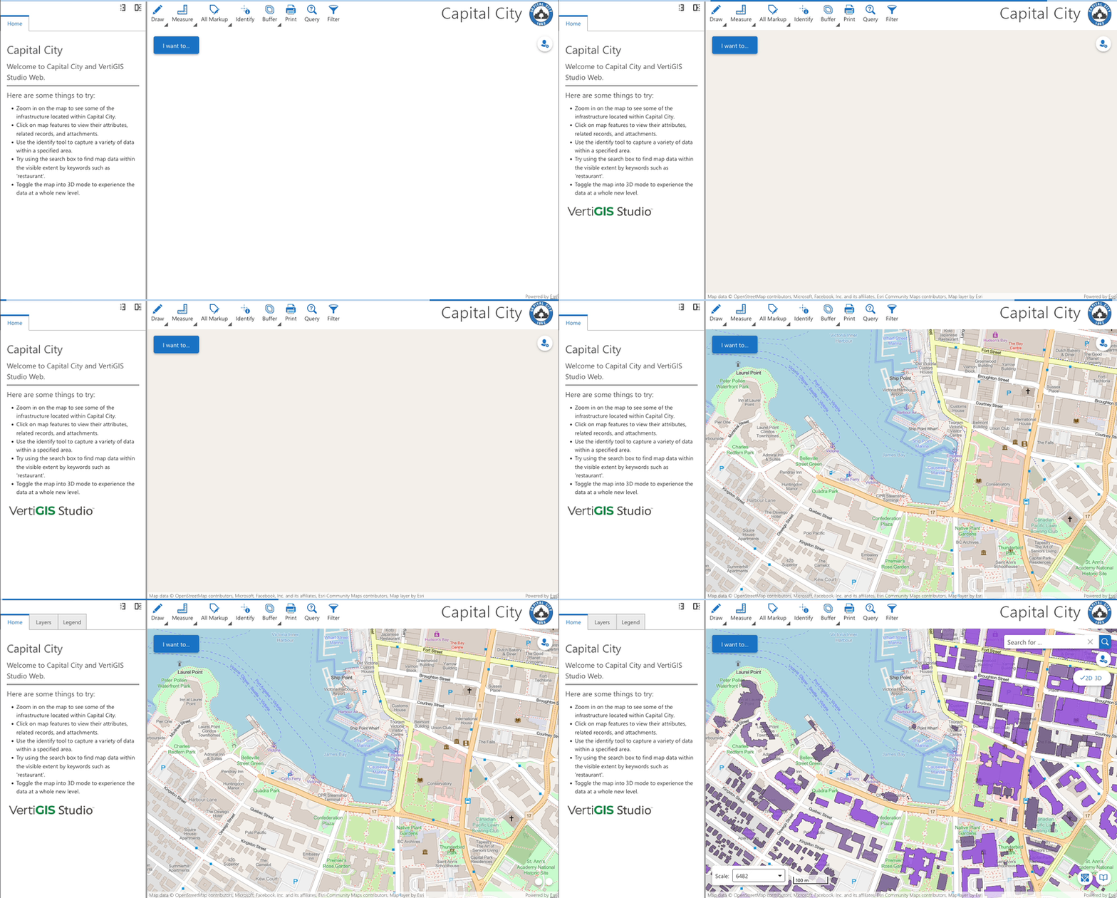
Multiple options are available to denote a loading state, the "3 dot loader", "skeleton", "circular", and "progress bar". These are indeterminate (unspecified wait time) indicators with determinate (known wait time) options for "circular" and "progress bar".
- The 3 dot loader, indeterminate only, is used when loading large areas such as an initial app launch.
- Circular indeterminate, used when loading large areas or areas with unknown content.
- Circular determinate, used when loading areas where progress can be measured and it provides value to the user.
- Linear indeterminate,
Skeleton (indeterminate)
This loader can be customized to display a placeholder of incoming content for example, a block of text or a results list. When using this method it is advisable to create a simplified layout, just enough to give the user an idea of whats coming. Skeleton helps improve perceived responsiveness. Read more about skeleton in the MUI docs.
Consider using Skeleton to:
- Display small portions of incoming content that can be represented with basic geometric shapes.


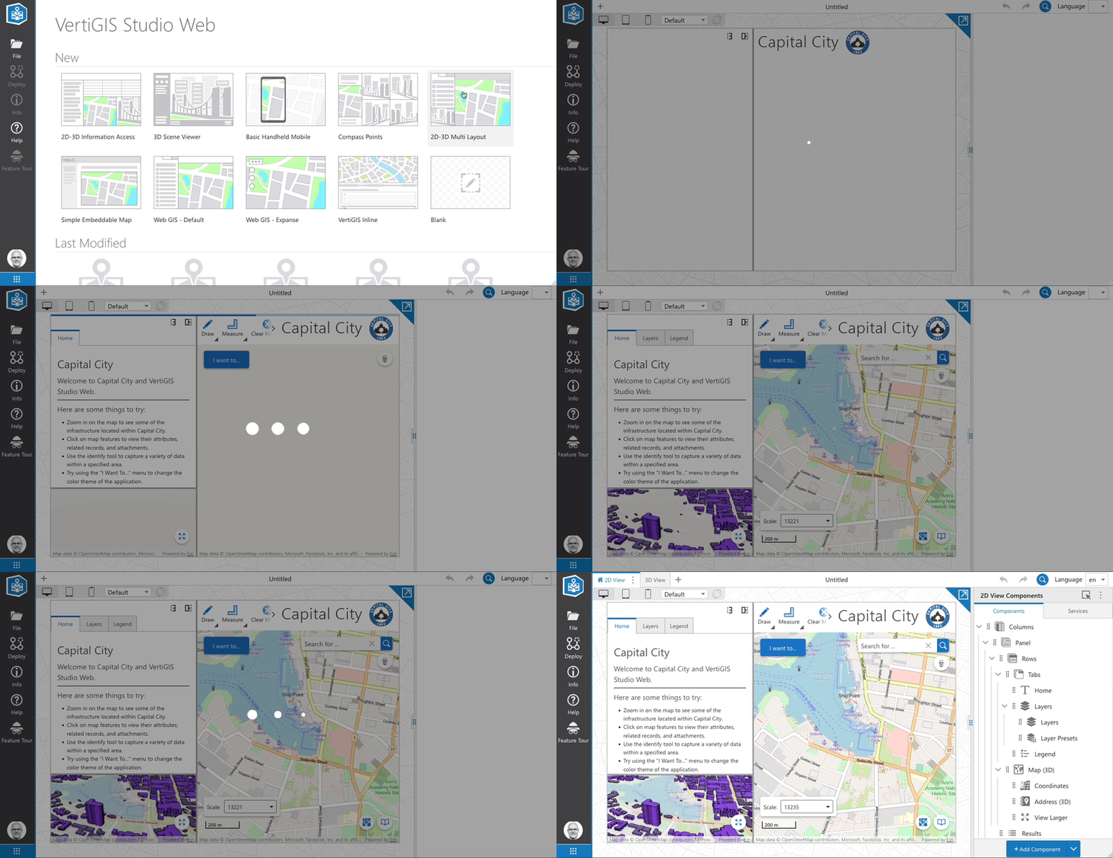
3 Dot Loader (indeterminate)
Use this when loading large areas such as during the first load of an app.
Consider using the 3 dot loader for:
- Large blocks or regions of a layout that are loading.
- If the incoming content is of unknown size, shape, or layout.

Loading bar (indeterminate)
Typically used during the first load of an app. Placed at the top of the page as an overlay to not affect component positioning. Color is determined using the app's primary color.
Tabs
Normal Tabs
Scrollable Tabs
Icon Tabs
Indicator Color Tabs
Vertical Tab
Panels & Panel Navigation
Panels
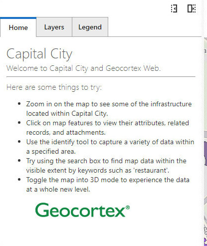
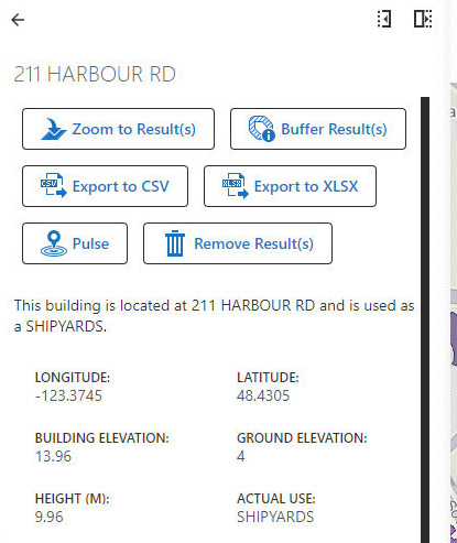
Using Panels in our application affords the user a good deal of information all contained in an easy to view place. Most information can be placed within a panel. Panels are designed with a minimum width of 365px so that they work on smart phone screens as well as larger tablet and desktop displays. The user can resize the panels with the provided drag handles. For full information regarding panels, refer to the Developer Center.
Panel Navigation
Panels come with an assortment of configurable navigation controls:
 Maximize: This button will extend the content of the panel to fill the entire view width.
 Minimize: The minimize button will collapse the panel down fully. It is expandable again by click the ‘Restore to Original Size’ button that replaces minimize.
 Back Button: Navigates you to the previous panels content.
 Close Button: Closes the panel entirely.
Examples
Dialogs
Modal Dialogs
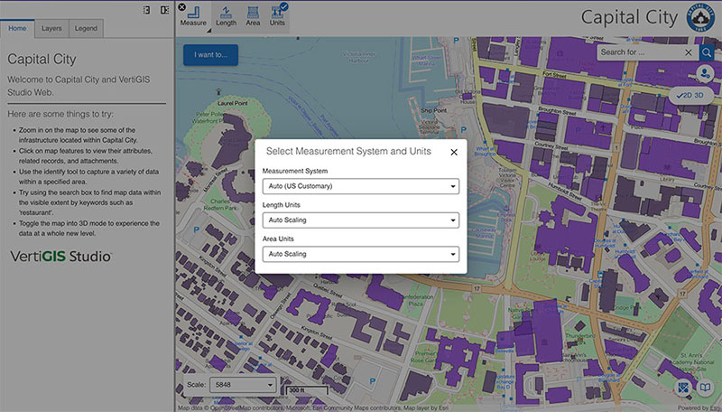
Occasionally, there will be a need to display information, warn the user, or present controls in a manner that needs to utilize a more focused interface. Modal dialogs provide a flexible layout strategy to allow the user to put any content they want before the user and draws their focus to it, setting the rest of the app into a non-interactive state until it is dismissed. This allows important information to be displayed, and preserves the background information.
Examples
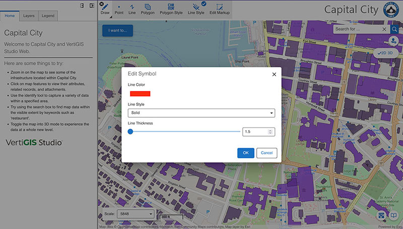
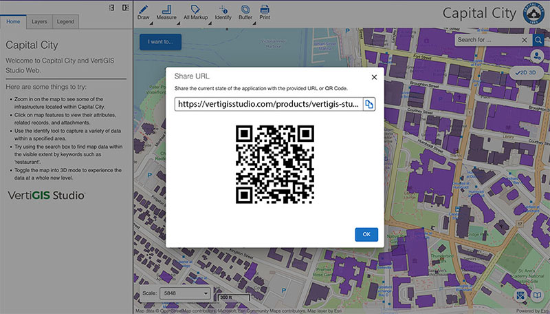
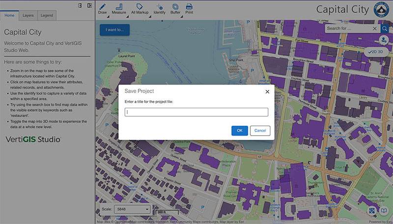
Additional information regarding modal alerts can be found in the Developer Center.
Alerts
Dialogs are a good method of presenting alerts to the user, since they allow information that is relevant to a state change, or problem, without navigating away, or impacting the information within the app. This can include, but are not limited to:
- Destructive actions that would otherwise destroy information that has been altered.
Alerts must always preface the problem, and offer the user the ability to dismiss, edit, or disregard the problem in question.
Notifications
Notification appear in a non-invasive manner. They can be configured to either dismiss automatically, require the user to dismiss, or not be dismissable at all.
There are four types of notifications available to use:
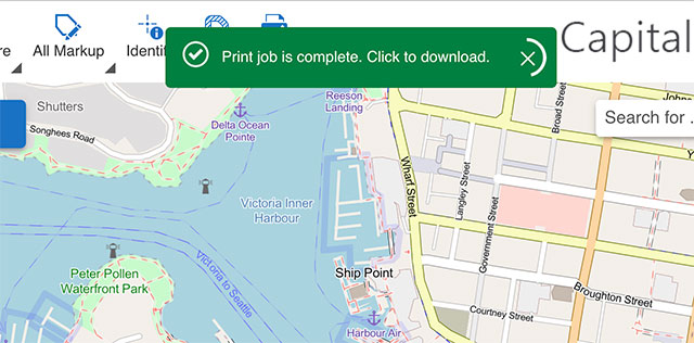
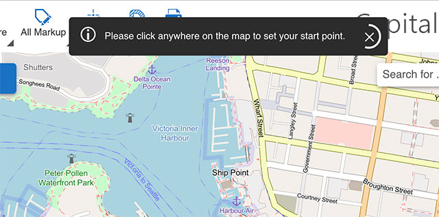
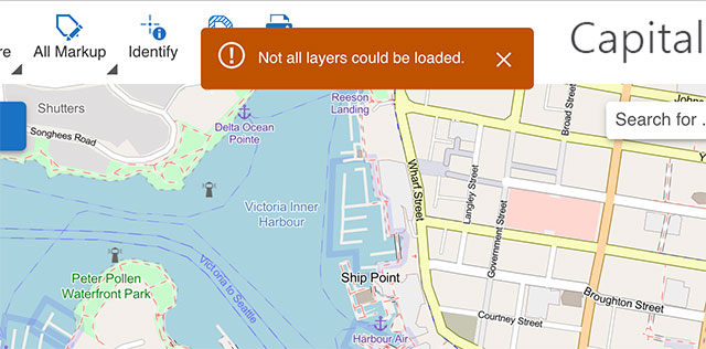
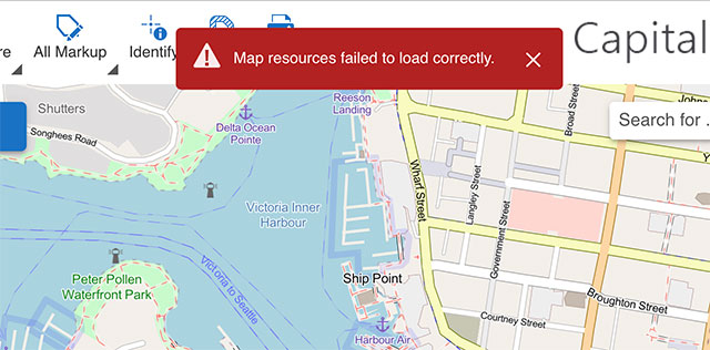
Care should be taken when choosing to use a notification as too many notifications can annoy users by being overused.
For full information regarding panels, refer to the Developer Center.
Typography
Good typography plays a large role in creating not only an aesthetically pleasing app but a usable one. It is essential that style guidelines and semantics are followed as they ensure consistency across our suite of applications. For example, by keeping headings and body text at predefined sizes makes it easier for developers to implement. There is no guessing required as to which size an H1 should be. Users working with our applications will instantly know they are using a VertiGIS app simply but the way it looks (and behaves).
Type Scale
Font Stack
Our current font stack is "Segoe UI, Helvetica Neue, Roboto, Helvetica, Arial, sans-serif". Segoe UI is installed by default on Windows. MacOS/iOS will take advantage of Helvitca Neue and Roboto is Android's default font. Font sizes rely on the browser default font-size of 16px. This value should not be changed.
Headings
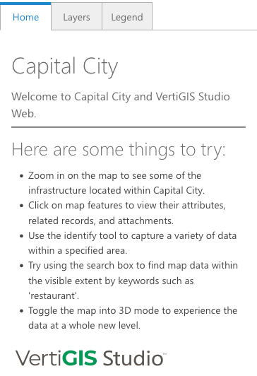
Headings are the largest text on the screen and are used for titles. They help organize content and demonstrate importance using a hierarchy that ranges from 1-6. For more information regarding headings and the best practices for usage please refer to W3C and MDN Web Docs.
Considerations when using Headings
- Multiple H1 on a page is not considered best practice. Reserve for app title or to describe the content of a page.
- Do not alter the size, style, and weight of headings using CSS or HTML tags.
- Always choose a heading based on the hierarchy of the content and not on the heading's size.
Example of Headings, Subtitles, and Body1 in Studio Web
Subtitles (1 & 2)
Smaller than headings, used for medium-emphasis. Usually paired with a heading to enhance context. 2 sizes are provided.
Considerations when using Subtitles
- Avoid using subtitles as a replacement for body text.
Body (1 & 2)
Use for long-form text (paragraphs). Emphasis can be added using standard HTML tags, for example strong and em. 2 sizes are provided.
Considerations when using Body
- Should never be used in place of a heading.
Caption
Typically used for annotating images.
Considerations when using Captions
- Avoid using captions as a source of small/italicized Body text.
Colors
Studio Colour Palette
The full palette available to Studio products. Each family runs from 50, the lightest, through 900, the darkest, followed by the A shades, which are more saturated accents intended for emphasis rather than for large areas.
Pick colours from this palette rather than sampling a value out of a mockup. Note that a swatch being in the palette does not make any pairing of two swatches accessible, so check the combination you are using against Colour Contrast.
Studio Web Colour Sets
| Studio Web Accent |
|---|
| accent-50 #E3EFF9 |
| accent-100 #B5D3EE |
| accent-200 #89B8E4 |
| accent-300 #619FD9 |
| accent-400 #3C88CF |
| accent-500 #1A72C4 |
| accent-600 #1764AB |
| accent-700 #135593 |
| accent-800 #10477A |
| accent-900 #0D3961 |
| Base Grays |
|---|
| base-50 #EBEBEB |
| base-100 #C6C6C6 |
| base-200 #A1A1A1 |
| base-200 #A1A1A1 |
| base-400 #575757 |
| base-500 #323232 |
| base-600 #2C2C2C |
| base-700 #252525 |
| base-800 #1F1F1F |
| base-900 #191919 |
| Alert States |
|---|
| AlertRed #B22222 |
| AlertAmber #BF5300 |
| AlertGreen #008040 |
| AlertStandard (Base 600) #2C2C2C |
Branding Properties
| Property Name | Light Theme | Dark Theme |
|---|---|---|
| accentIconBackground | white | white |
| accentIconBackgroundHover | white | white |
| accentIconBorder | base-600 | white |
| accentIconBorderHover | base-600 | white |
| accentIconForeground | accent-500 | accent-500 |
| accentIconForegroundHover | accent-500 | accent-500 |
| alertAmberBackground | alertAmber | alertAmber |
| alertAmberBackgroundHover | white | white |
| alertAmberBorder | alertAmber | alertAmber |
| alertAmberBorderHover | alertAmber | alertAmber |
| alertAmberForeground | white | white |
| alertAmberForegroundHover | white | white |
| alertAmberIcon | white | white |
| alertAmberIconHover | alertAmber | alertAmber |
| alertButtonBackgroundDisabled | base-100 | base-600 |
| alertButtonBorderDisabled | base-100 | base-600 |
| alertButtonForegroundDisabled | base-400 | base-200 |
| alertButtonIconDisabled | base-400 | base-200 |
| alertGrayBackground | base-600 | base-600 |
| alertGrayBackgroundHover | white | white |
| alertGrayBorder | base-600 | base-600 |
| alertGrayBorderHover | base-600 | base-600 |
| alertGrayForeground | white | white |
| alertGrayForegroundHover | base-600 | base-600 |
| alertGrayIcon | white | white |
| alertGrayIconHover | base-600 | base-600 |
| alertGreenBackground | alertGreen | alertGreen |
| alertGreenBackgroundHover | white | white |
| alertGreenBorder | alertGreen | alertGreen |
| alertGreenBorderHover | alertGreen | alertGreen |
| alertGreenForeground | white | white |
| alertGreenForegroundHover | alertGreen | alertGreen |
| alertGreenIcon | white | white |
| alertGreenIconHover | alertGreen | alertGreen |
| alertRedBackground | alertRed | alertRed |
| alertRedBackgroundHover | white | white |
| alertRedBorder | alertRed | alertRed |
| alertRedBorderHover | alertRed | alertRed |
| alertRedForeground | white | white |
| alertRedForegroundHover | alertRed | alertRed |
| alertRedIcon | white | white |
| alertRedIconHover | alertRed | alertRed |
| buttonBackground | white | base-900 |
| buttonBackgroundDisabled | base-100 | base-600 |
| buttonBackgroundHover | base-100 | base-100 |
| buttonBorder | base-600 | base-200 |
| buttonBorderDisabled | base-300 | base-300 |
| buttonBorderHover | base-700 | base-700 |
| buttonForeground | black | white |
| buttonForegroundDisabled | base-400 | base-200 |
| buttonForegroundHover | black | base-900 |
| buttonIcon | accent-500 | white |
| buttonIconDisabled | base-400 | base-200 |
| buttonIconHover | accent-500 | accent-500 |
| disabledIconFill | base-500 | base-500 |
| emphasizedButtonBackground | accent-500 | accent-500 |
| emphasizedButtonBackgroundDisabled | accent-100 | accent-200 |
| emphasizedButtonBackgroundHover | accent-50 | accent-50 |
| emphasizedButtonBorder | accent-500 | accent-100 |
| emphasizedButtonBorderDisabled | accent-100 | accent-700 |
| emphasizedButtonBorderHover | accent-500 | accent-500 |
| emphasizedButtonForeground | white | white |
| emphasizedButtonForegroundDisabled | accent-700 | accent-700 |
| emphasizedButtonForegroundHover | accent-700 | accent-600 |
| emphasizedButtonIcon | white | white |
| emphasizedButtonIconDisabled | accent-700 | accent-700 |
| emphasizedButtonIconHover | accent-500 | accent-500 |
| headerBackground | base-100 | base-800 |
| inputBorder | base-600 | base-200 |
| inputBorderDisabled | base-200 | base-300 |
| listContent | base-900 | base-100 |
| listMenuItemBorder | base-200 | base-800 |
| listSecondaryContent | base-200 | base-100 |
| mapWidgetBackground | white | white |
| mapWidgetBackgroundDisabled | base-50 | base-50 |
| mapWidgetBackgroundHover | accent-500 | accent-500 |
| mapWidgetBorder | white | white |
| mapWidgetBorderDisabled | base-50 | base-50 |
| mapWidgetBorderHover | accent-500 | accent-500 |
| mapWidgetForeground | accent-500 | accent-500 |
| mapWidgetForegroundDisabled | base-500 | base-500 |
| mapWidgetForegroundHover | white | white |
| mapWidgetIcon | accent-500 | accent-500 |
| mapWidgetIconDisabled | base-500 | base-500 |
| mapWidgetIconHover | white | white |
| none | transparent | transparent |
| panelBorder | base-400 | base-600 |
| primaryAccent | accent-500 | accent-50 |
| PrimaryAccentDisabled | base-300 | base-300 |
| primaryAccentHover | base-600 | base-200 |
| primaryAccentLarge | base-500 | base-200 |
| primaryBackground | white | base-800 |
| primaryBackgroundDisabled | base-50 | base-500 |
| primaryBorder | base-100 | base-600 |
| primaryForeground | base-900 | white |
| primaryForegroundDisabled | base-200 | base-500 |
| secondaryBackground | base-50 | base-900 |
| secondaryBorder | base-200 | base-700 |
| secondaryForeground | base-800 | base-200 |
| tabPrimaryForeground | accent-500 | base-200 |
| tabSecondaryForeground | base-900 | white |
| itemSelectedBackground | accent-50 | accent-800 |
| itemHoverBackground | accent-200 | accent-500 |